CO•OK
next course please
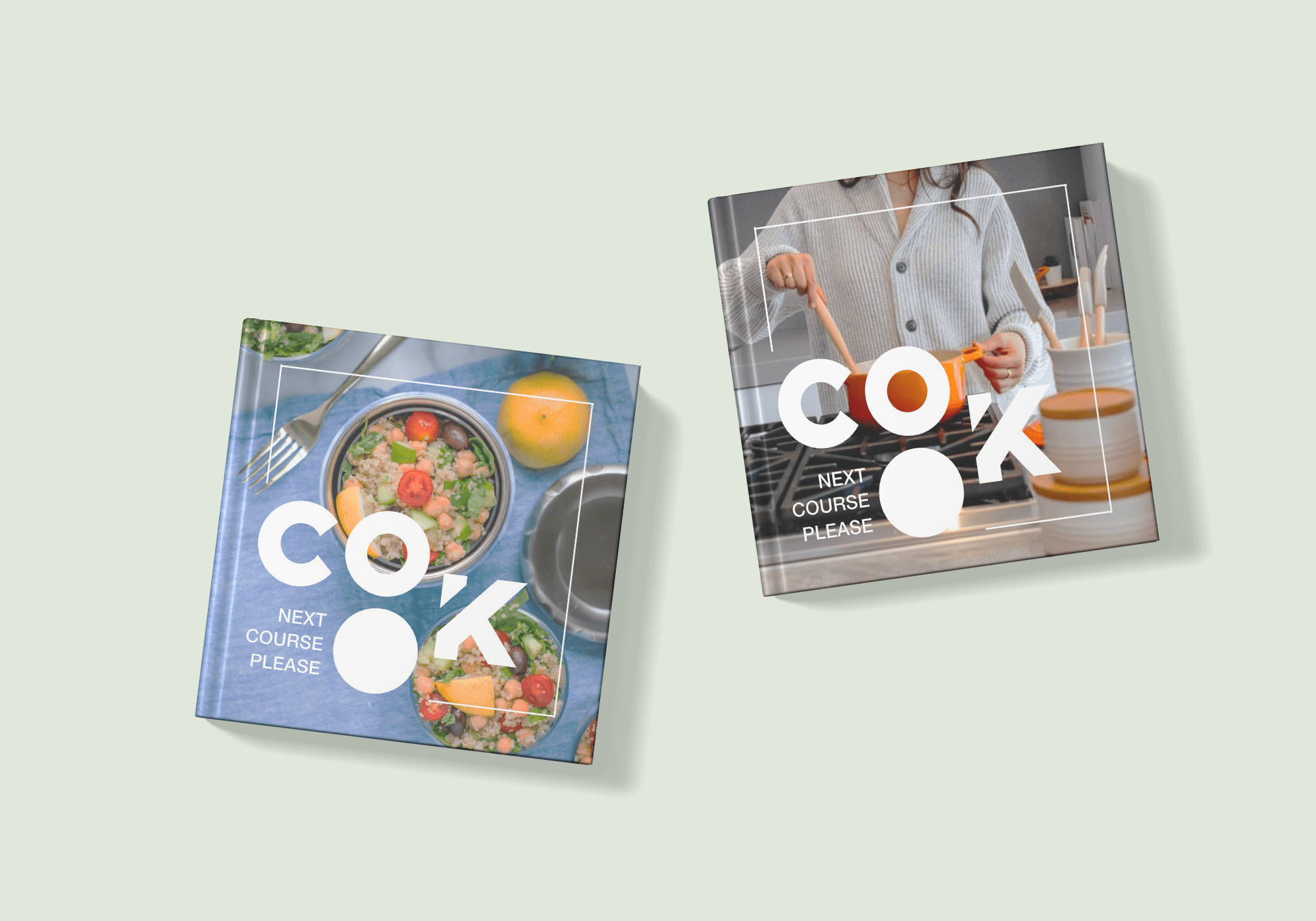
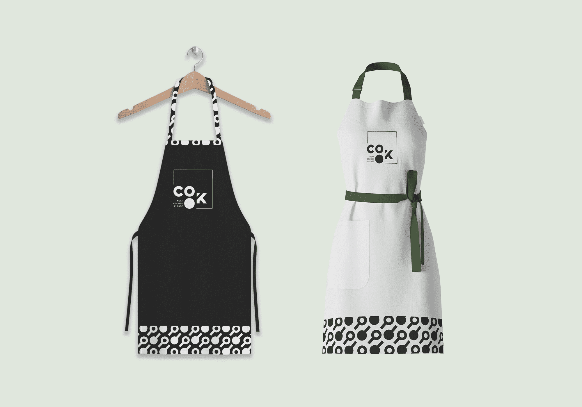
As part of the course “Brand Identity & Corporate Design” at UAS St. Pölten a fictional company was founded in groups. For this company we were asked to then create a visual identity. My main tasks were in the area of logo development and the design of the website. Furthermore, print products, merchandise and a complete brand book were designed, which we also had printed and bound ourselves.
The aim of the company we named CO•OK is to show people the joy of cooking fresh meals. The claim of the company „next couse please“ is a play on words and suggests a course in the sense of further education, as well as a meal.
With the wide range of recipes and the variety of topics, everyone is able to discover the right course for themselves. Group dynamics can be strengthened or one can use the opportunity to make new friends, by joining public workshops. The cooking courses are for everyone: whether complete newbies, or professionals who want to continue their education and are looking for new inspiration.
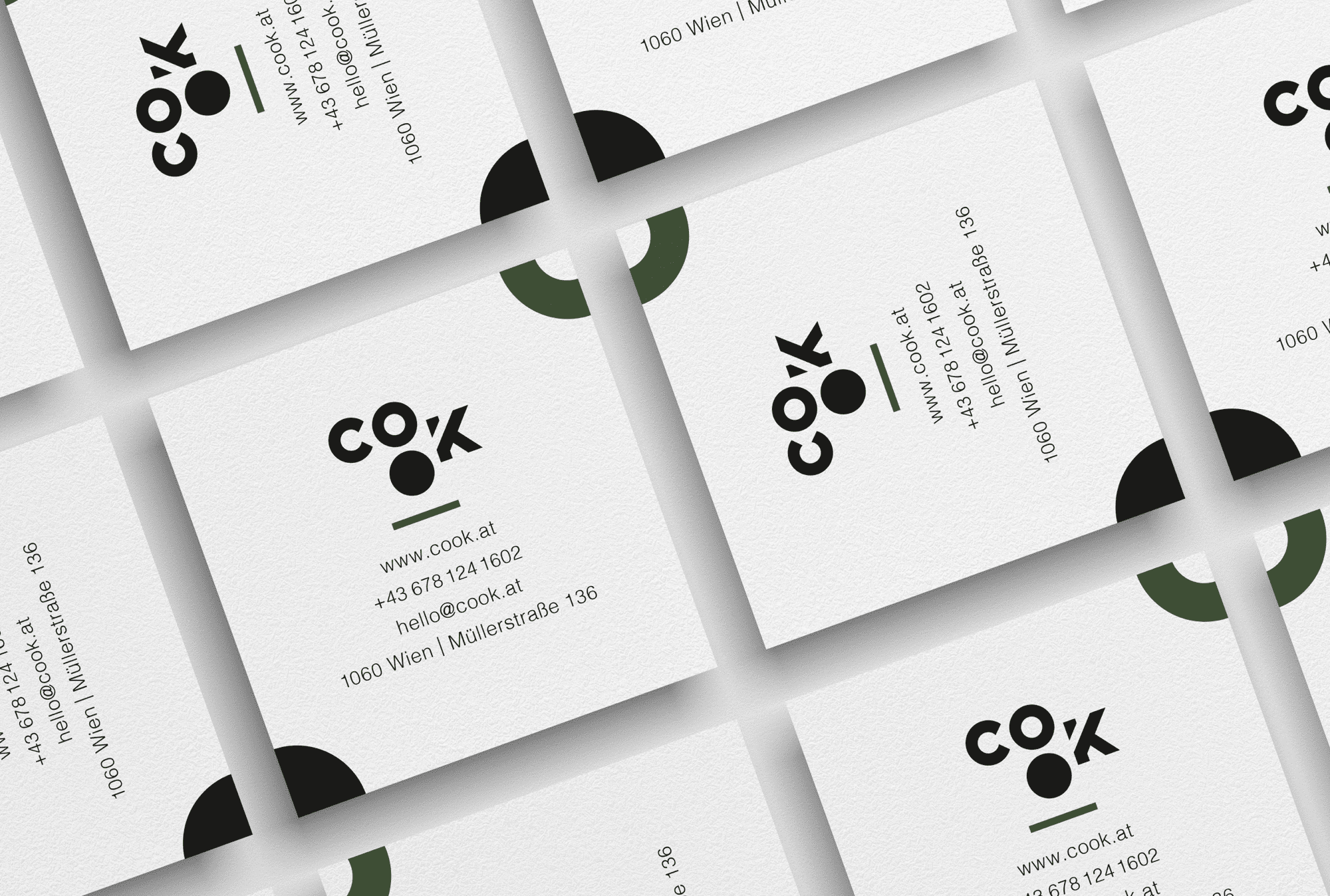
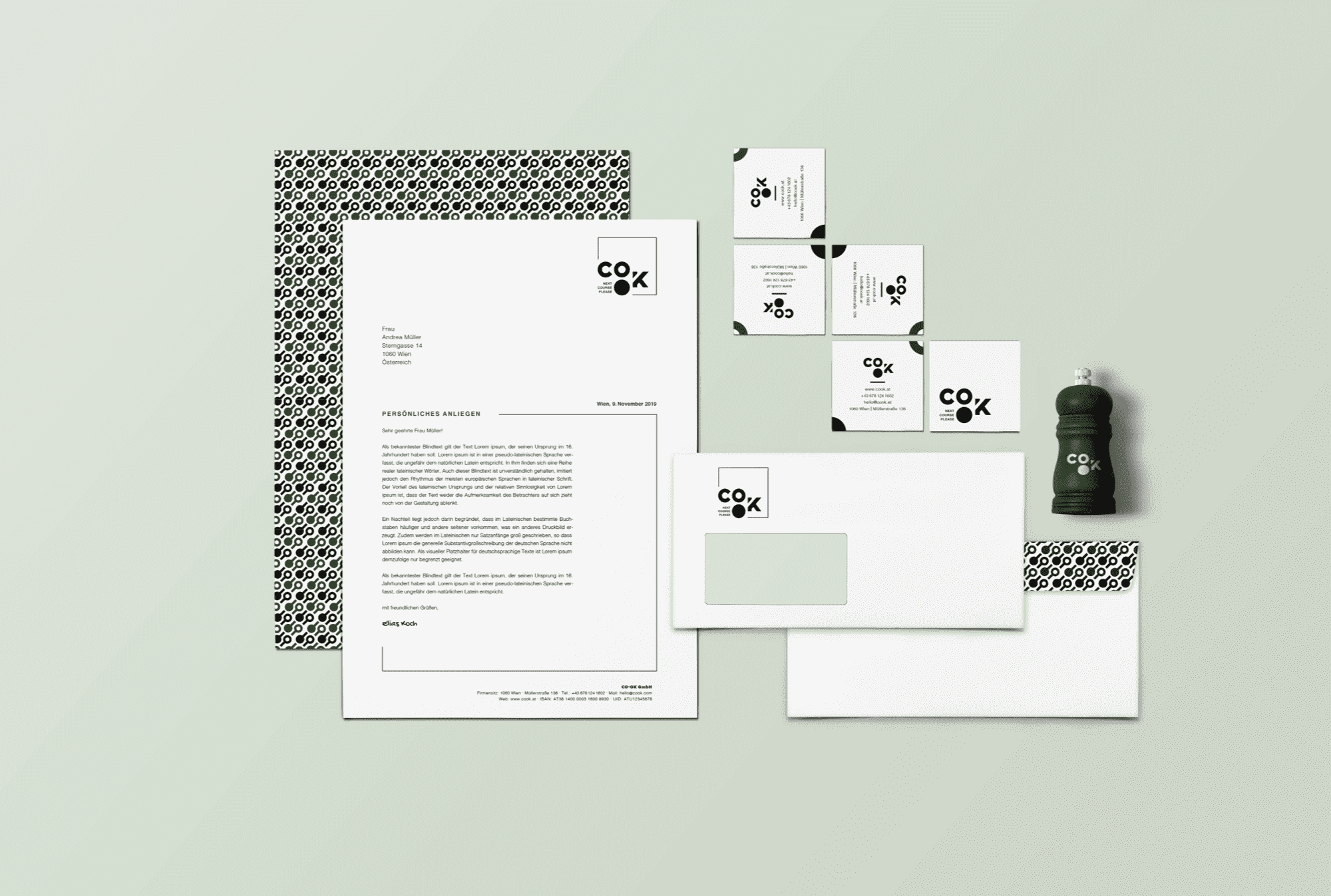
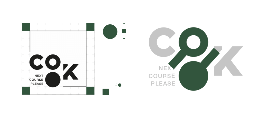
The Logo
The aim of the company we named CO•OK is to show people the joy of cooking fresh meals. The claim of the company „next couse please“ is a play on words and suggests a course in the sense of further education, as well as a meal.
With the wide range of recipes and the variety of topics, everyone is able to discover the right course for themselves. Group dynamics can be strengthened or one can use the opportunity to make new friends, by joining public workshops. The cooking courses are for everyone: whether complete newbies, or professionals who want to continue their education and are looking for new inspiration.
The Brand Book
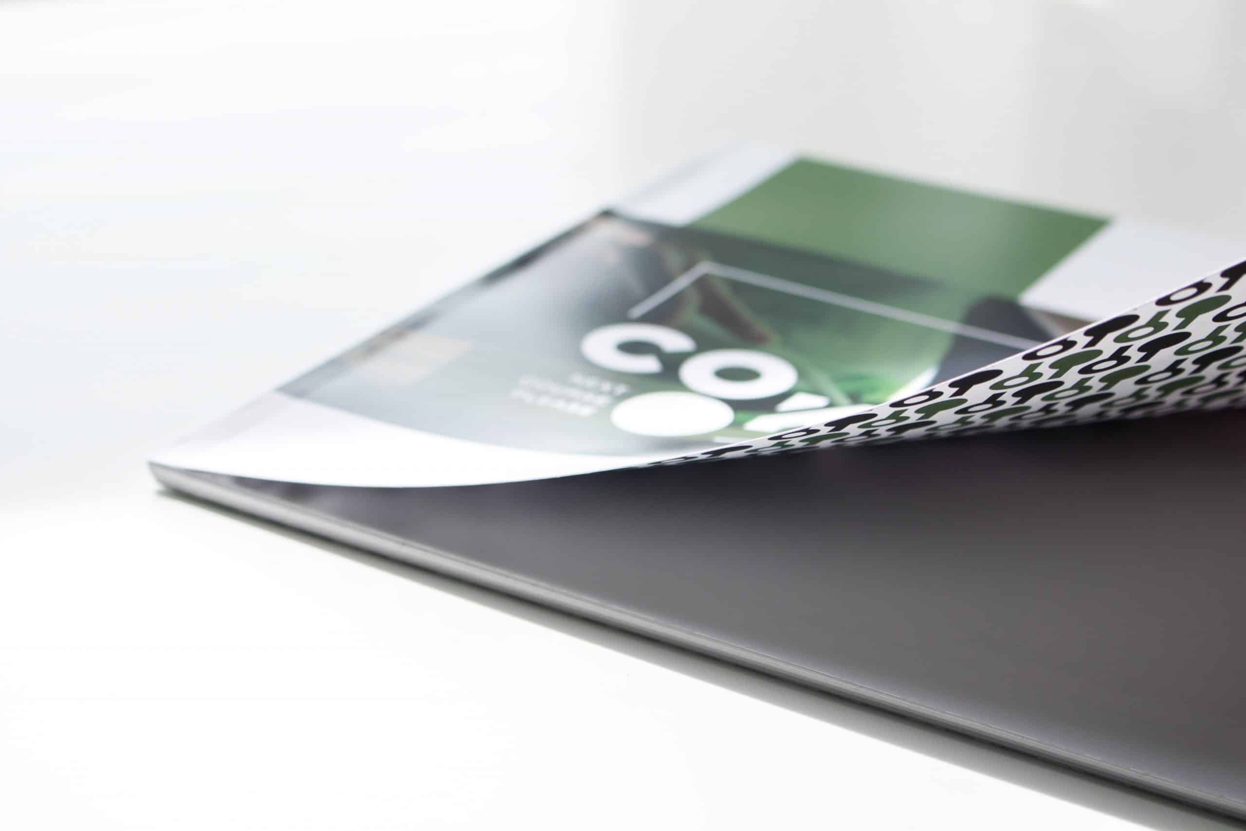
As already mentioned at the beginning, a brand book was designed as part of this project. All information about the company itself, the logo, the color palette and images up to the look of the website and the branded products can be found here. You can scroll through the digital version below (German).
The website
The website offers a good insight into which courses are offered and shows many pictures of past events. During implementation, particular attention was paid to providing mobile users with an equally appealing website.
The CO•OK homepage is divided into several sections. In the top area is the navigation bar. This is followed by a photo, which should catch the user’s attention and convey what CO•OK is all about. In another area, upcoming events can be viewed.
Moreover, comments from participants, a link to the online store (for merchandise and products), links to sponsors, as well as links to the social media channels can be seen. The different areas are loosened up by photos and the recurring pattern. Furthermore, a picture gallery was integrated to show the user how the courses can look like. In order to appear more authentic to the user, an Instagram wall was integrated as well. Here the user can see authentic impressions of what participants have shared about the course.
Client/Context
FH St. Pölten
Master Digital Design
Brand Identity & Corporate Design
Time
Winter 2019/2020
Used Tools
- Adobe Illustrator
- Adobe Photoshop
- Adobe InDesign
- Sketch
